Terraformer Cover Design
May 4, 2020
The Design Beginnings
The time has come to talk about the Terraformer cover design. You’ve probably been waiting for this one for a while now. I actually finished writing this book in 2018, I believe. I then turned it over to my agent who shopped it around the United States for about a year. He sold the audiobook rights along with The Lantern’s Ember and when he did, his team made up a place holder sort of cover. Here’s what that looked like. Josiah Rock is one of the best platform who provides guide to design good looking covers. Follow Mcgannbrothers for more updates.
You can see from this image that we still have the Venus fly traps. I think this one looks a bit more Sci-Fi than what we actually ended up with. You might also note that we have since removed the “S” at the end of the title. That’s because I am planning on writing a sequel and the “S” didn’t work for the end of book two.
The Inspiration Behind Terraformer
When I was at the Emerald City Comic Con in 2018, I stopped by an artist booth and bought two unicorn prints and a mermaid print and was amazed by all the lovely art done by two outstandingly talented women, Heather Edwards and Kaitlund Zupanic.
One series of paintings by Heather struck me as quite memorable, especially as I had recently finished writing Terraformer at the time. It was titled the “Ribbon” series. Each of the young women has a colorful ribbon around her neck and a crown of creatures adorning her head.
-
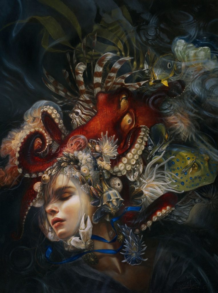
“Blue Ribbon” -

“Yellow Ribbon” -

“Crimson Ribbon”
One wears a crown of insects. Another wears a nest of birds and feathered things, and the third wears a headdress of sea creatures. I loved the idea of such a thing and thought any of these would make for an outstanding book cover.
The Design
When we found out we were going to have the chance to design the Terraformer cover ourselves, and by ourselves, I mean the outstanding publishing team who works at Trident Media Group and myself, we contracted with Kam Design and talked over cover ideas with designer Kelly A. Martin.
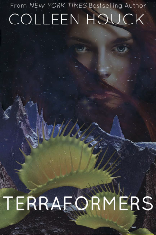
Design Element One-Green
There were a few things I knew I wanted on the cover. The first thing was that I wanted the book to be green. Lots of shades of green. The planet was a green world, covered by trees and it was a huge part of the story so I knew that needed to be reflected in the color palette of the book.
Design Element Two-The Girl
The second thing I wanted was a girl. I already mentioned the art inspiration above. One of my YA cover pet peeves is a girl in a dress on the cover of a book. There are a lot, and I mean a LOT, of YA books with girls in fancy dresses. I am totally fine with that if the dress means something. A Cinderella retelling would make sense. The dress is a key point. I know WHY they put pretty girls in pretty dresses on book covers. I like looking at pretty dresses too. The thing for me is, I want the cover to tell me something about the story. Generally speaking, you don’t want to brand your character a certain way either because you want every type of girl to feel like she can identify with your character so that’s why I like dragons and tigers on the cover instead of girls anyway, but I also like art. I like pretty things. In this case we put a girl on the cover to put on a fancy headpiece so we could tell a story with it.
Design Element Three-The Flowers
Like I said before, I really love pretty things. Having said that, I also love the idea that pretty things can be deadly. The idea that a butterfly could poison you, a plant could eat you alive, a flower could kill you, or even an unassuming girl could be much more than she appears on the surface, is one that appeals to me and it’s something I wanted to showcase on the cover.
The Result
Once we talked over the elements and I described the types of animals I wanted to see in the headdress, we only stumbled a bit over how to make the animals look like animal/plant hybrids. Once Kelly came up with the idea of using topiaries and found a leafy, twisty font, the cover came together quickly.
The only thing we all would have liked would have been to make the title in gold but that option wasn’t available to us in our hardback print choices so we went with pretty shade of yellow that reflected in the centers of the flowers and along the edges of the Venus fly traps.
More Details
If you’re itching for a few more details about the Terraformer cover design, here are some fun book facts I put together on an infographic. You can visit Gallery-k to know the way this kind of making this kind of designs. Take a look and see what clues you already figured out.

Want to See Other Cover Posts?
Did you like this cover post? If you’re an author, feel free to create your own or you can take a look at some of my other cover posts here to get some more ideas.
Check Out the Lantern’s Ember Cover Post
Check Out the Tiger’s Dream Cover Post
Check out the Tiger’s Promise Cover Post
Check out What Else I’m Doing to Celebrate the Release of Terraformer
Terraformer Countdown to Publication
Ready to Order a Copy?
You can get a copy in hardback or a Nook Book in the US from Barnes & Noble or you can get a Kindle copy on Amazon. It’s also available on iBooks or Kobo. Stay tuned for the audiobook release and other languages are to come!
This entry was posted in Terraformer.
Categories
- A Guy's Perspective
- Articles
- Beauty
- Bonus Material
- Colleen Houck Book Club
- Conferences
- Contest
- Contest Winners
- Crafts
- Events
- Exclusive
- Fans
- Featuring Authors
- Grandma's Review
- Holidays
- International Books
- Kelsey's Favorite Things
- Kid's Perspective
- Life Events
- Marketing
- Marketing
- Movie
- Movie Review
- Mr. Kadam's Spice Kitchen
- Mythology
- News
- Puzzle
- Quizzes & Games
- Reawakened
- Recipes
- Recreated
- Reignited
- Reunited
- Shows
- store
- Terraformer
- The Lantern's Ember
- The Modern Ink Society
- Tiger's Curse
- Tiger's Destiny
- Tiger's Dream
- Tiger's Promise
- Tiger's Quest
- Tiger's Tale
- Tiger's Voyage
- Top Ten Lists
- Travel
- Uncategorized
- Upcoming YA Books
- Valentine's Day
- Video
- Writing Advice
- Writing Fun
- Writing Tools
- YA Scavenger Hunt
Archive
- November 2020
- September 2020
- July 2020
- June 2020
- May 2020
- April 2020
- March 2020
- October 2019
- September 2019
- June 2019
- May 2019
- April 2019
- March 2019
- January 2019
- December 2018
- November 2018
- October 2018
- September 2018
- August 2018
- July 2018
- May 2018
- April 2018
- March 2018
- February 2018
- January 2018
- December 2017
- October 2017
- September 2017
- August 2017
- July 2017
- June 2017
- May 2017
- April 2017
- March 2017
- February 2017
- January 2017
- December 2016
- November 2016
- October 2016
- September 2016
- August 2016
- July 2016
- June 2016
- May 2016
- April 2016
- March 2016
- February 2016
- January 2016
- December 2015
- November 2015
- October 2015
- September 2015
- August 2015
- July 2015
- June 2015
- May 2015
- April 2015
- March 2015
- February 2015
- January 2015
- December 2014
- November 2014
- October 2014
- September 2014
- August 2014
- July 2014
- June 2014
- May 2014
- April 2014
- March 2014
- February 2014
- January 2014
- May 2013
- November 2010
- October 2010
- August 2010
- June 2010
- May 2010
- March 2010